Colors play a key role to make things look good, whether it’s the clothes you wear or the presentation you give at work. But, not everyone is able to guess that orange and blue makes a perfect combination. So, if you can’t trust your own judgment, it’s better to understand and rely on the basics of color theory to always choose the right colors.
Yeah! Color selection is an art that takes a long time and a lot of experience to master. Choosing the right color scheme and understanding the physiology of color matching depends on the feel that you’re going for. Like, certain colors are perfect match for certain topics. For instance, hunters and fisherman gravitate towards rustic colors. White is a prominent color for websites dealing with wedding photographs. This means that physiology of color matching goes with the topic. Color-matching technique learner’s, you can experiment with different colors for highlights and accents while staying true to the primary color-base in such fields. Don’t forget, each website has some specific goals. So, one must try to choose the colors accordingly to match those goals.
Physiology Of Color Matching
Let’s understand how does color affect us?
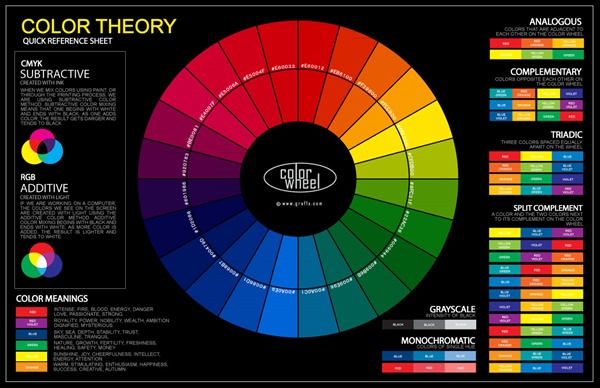
Color is such a powerful and influential tool that brings a fresh new change in your life, but sometimes your personal and cultural associations affect your experience towards a particular color. Usage of warm colors for foreground and cool colors for background enhances the perception of depth. Moreover, colors act upon the body as well as the mind. For example -red color stimulates the senses and raises the blood pressure, while blue has opposite effect and relaxes the mind. Well! The most striking color illusions are those where identical colors, when surrounded by different backgrounds, appear to be different from each other.
Now, take a quick look at different color physiology combinations –
- Black, White and Gray

These colors are very impactful and great for backgrounds. Black suggests power, white suggest innocence and gray is a neutral color, but good choice for high
lighting tradition. - Pink

Gals favorite, agree! It’s playful, innocent and ideal for female candidates.
- Blue

It’s a good choice for sites that want to show dependability and trustworthiness. Light shades of blue are quite friendly.
- Yellow

The color is extremely bright and energizes you from within. It’s associated with happiness and warmth. This color is a right choice to portray authority and intelligence.
- OrangeIf you want to portray some movement and energy, orange is an ideal option for energetic and inviting touch.
Sources
Friends! You would be surprised to know that physiology of color matching is one of those topics that have no exact answer, but there are many choices that could be better suited to a specific purpose than others. Now-a-days many websites are working whole-heartedly to give you a better idea of what works and what doesn’t. You can take a look at the color-combinations of popular websites to see which color palettes work on a good note.
Another best place to get ideas is from magazines. One must try to learn how magazines build their branding colors, their pages, backgrounds and headers, etc for an attractive look. You may find it a much different medium, but the use of color for the audience still applies. Lastly, you can grab colors from images that you like most using color matching tools from the Google search engine and also learn the best color combinations provided on the sites such as – Pinterest, ColorCombos.com, etc.
We hope you enjoyed physiology of color matching such as matching colors to themes and ideas when creating a website. Learning appropriate implementation of colors is an art. With a few color matching techniques and tools you can use color physiology to your advantage. Though, it takes lots of practice and experience, but it’s a practice worth investing time into.


