
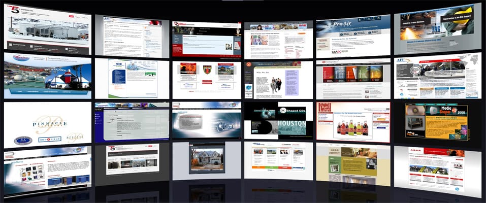
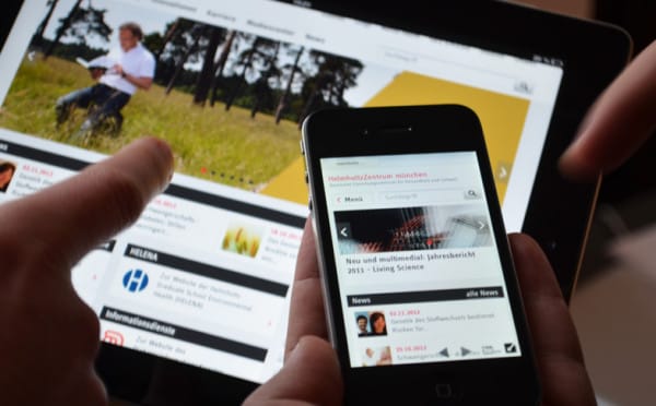
If you are a web designer or looking up to try your career as a web designer. One thing you have to be careful about is of making a responsive website. Most of the debutant web designers have a minimal knowledge about a responsive website. If asked they will answer it as a website that can fit with desktop, mobile or tablet automatically. But they actually have a least idea of how it works or what does it really means. If you are a beginner as a web designer you should have appropriate knowledge about the matter which will help you to create a fast and finest website. Read out the article to get some ideal guidance about making a responsive website.

Beginners Guide To First Responsive Website
Clear idea of a responsive website:
Actually to make a responsive website you should a clear view about the matter. As I have told earlier many amateur web designers don’t have a lucid idea about a responsive website. So keeping that in mind at first I want to share with you all the main features of a responsive website. That will guide you to have clear knowledge about it.

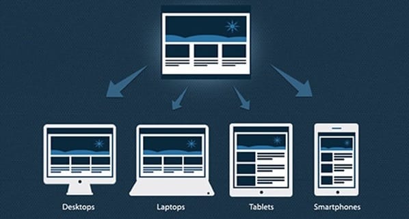
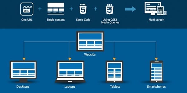
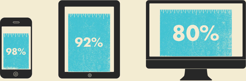
Actually a responsive website means three differently designed websites merged in a single one to adjust itself automatically according to the screen resolution. This type of website is actually made keeping in mind about different variations of screen resolution in this modern age. Nowadays most of the people access internet through their mobiles and laptops. So a responsive website allows these users to avail all the features in a mobile or a tablet which they get on browsing a website on desktop. So, it is a method of making responsive design according to different resolutions and merging it in a single website so that it automatically determine the screen resolution and adjust itself with it.
Making a responsive design system:
Actually making a responsive design is all about thinking a responsive system that will work according to the resolution. This system can be made with a minimum effort about thinking a lot about it. Normally it doesn’t means to make different design layouts instead of that it determines the changing of website structure with the screen resolution like stacking of different modules one below the other, switching into drop down menu, wrapping texts in a single container, hiding some advanced contents on mobile etc. If you can think more about this structural process it will make the responsive website development very optimal and easy.
Using different approaches:
There are mainly three approaches widely used to make a responsive website. It is generally based on the view point of the website. Actually while designing you have to decide which approach will be suitable for the website. Now let’s have an idea about the three different approaches.
Fluid Approach:
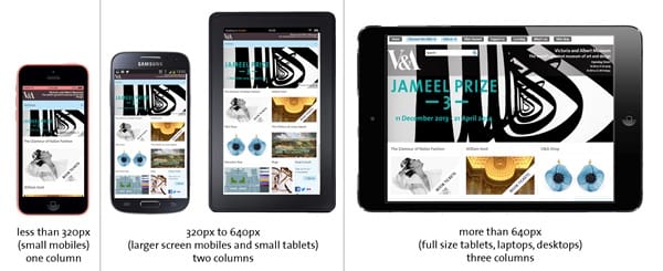
This approach doesn’t consider exactly the layouts instead of that the elements are defined in a particular percentage. Usually in this approach all the elements in a webpage adjusts itself according to the percentage defined. For example if the percentage level is defined as 50% width and the webpage is opened in a 1024 resolution it might contain 5 words in a line. While if it is opened in a larger resolution it may contain 10 words according the resolution size. The positive feature of this approach is that it uses the full width and the negative feature is that it can hamper the design layout of the full website adjusting itself according to the resolution.
Fixed Approach:
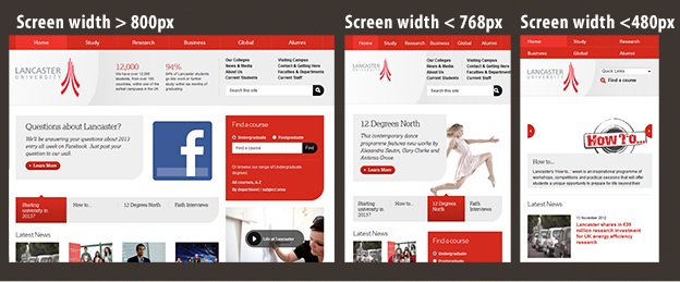
Some particular resolutions are kept in mind while using this approach. Normally the designer creates 3-5 particular sizes and the website automatically adjusts itself to the nearest size. For example suppose a website is designed in 4 different screen resolutions 320, 727, 960 and 1170. And if a user sees it from a desktop it will automatically convert itself in 1170 resolution, and if it is opened from a mobile it will adjust into 320 resolutions. But sometimes it doesn’t use the full screen width due to its particular mentioned sizes. The only advantage it provides that the designer gets much control over the website and it is also great while using some icons, specifically designed buttons etc.
Mixed Approach:
It is the most used and popular approach. Actually the above two approaches are mixed together to get a wide result. The elements which need fluid approach are made fluid and the elements which need fixed approach are made fixed. Such as background images, texts are made fluid and the icons buttons are made fixed.
Other factors which are to be kept in mind while designing a responsive website:

Fonts:
Always the fonts should be used from website server, Google web fonts or from other font libraries.

Responsive framework:
Explanation of how the website will change according to the resolution should be given by means of commenting on the screenshot. This makes the codes easily manageable.